Industry

Non-Profit / Entertainment

Client

SAG-AFTRA Foundation

SAG-AFTRA Foundation, member dashboard redesign
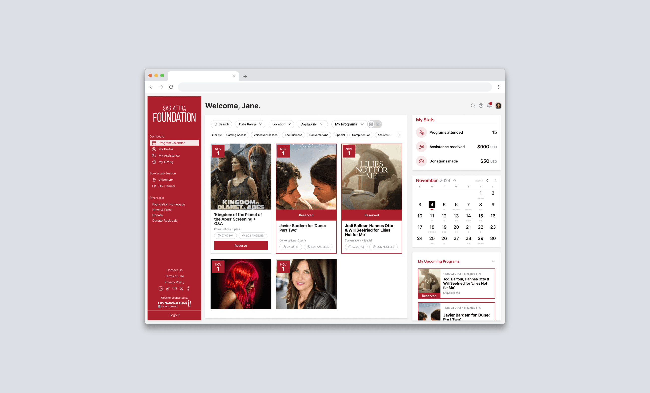
Main Project Image

A clearer dashboard experience for members who need quick access to important tools

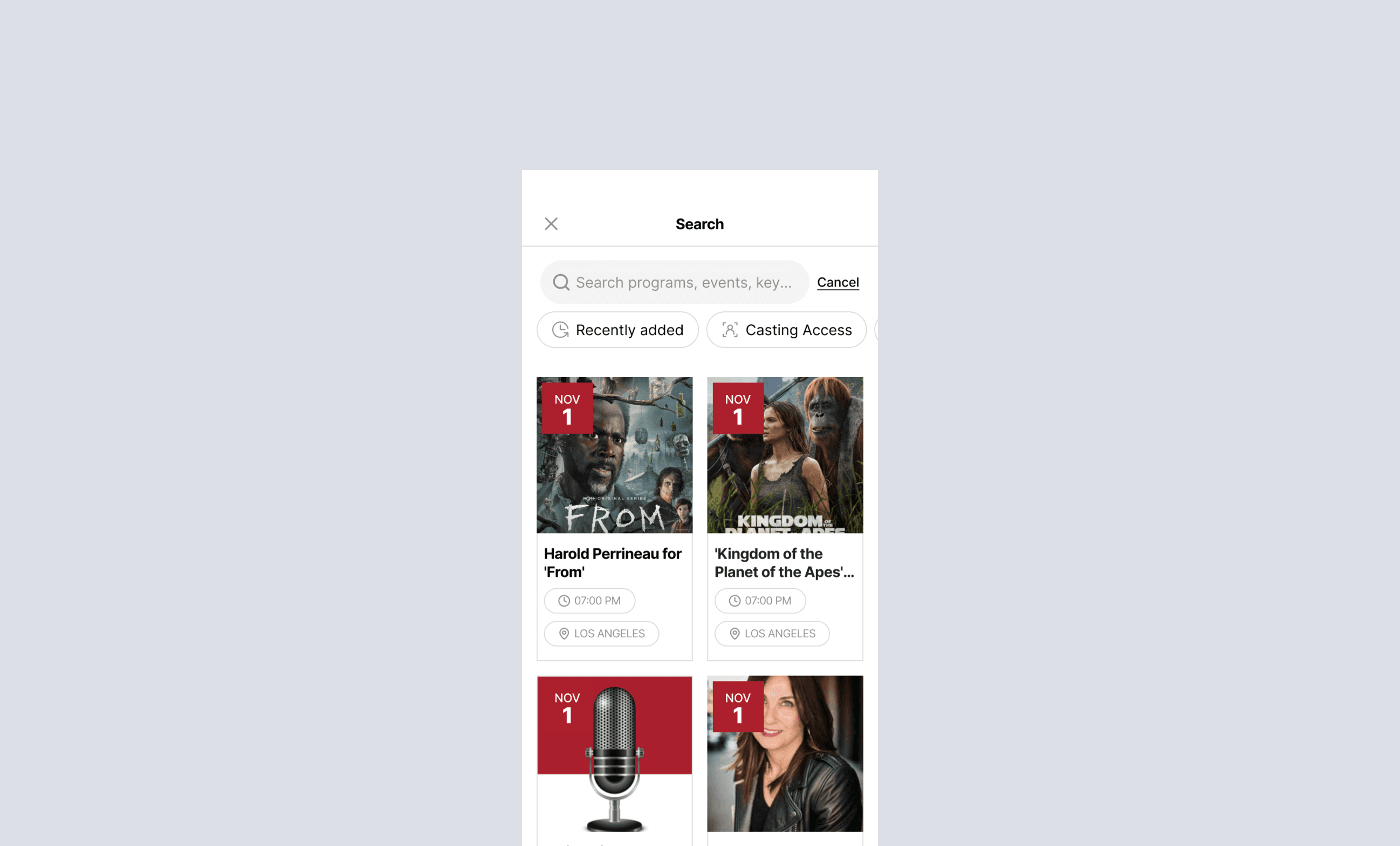
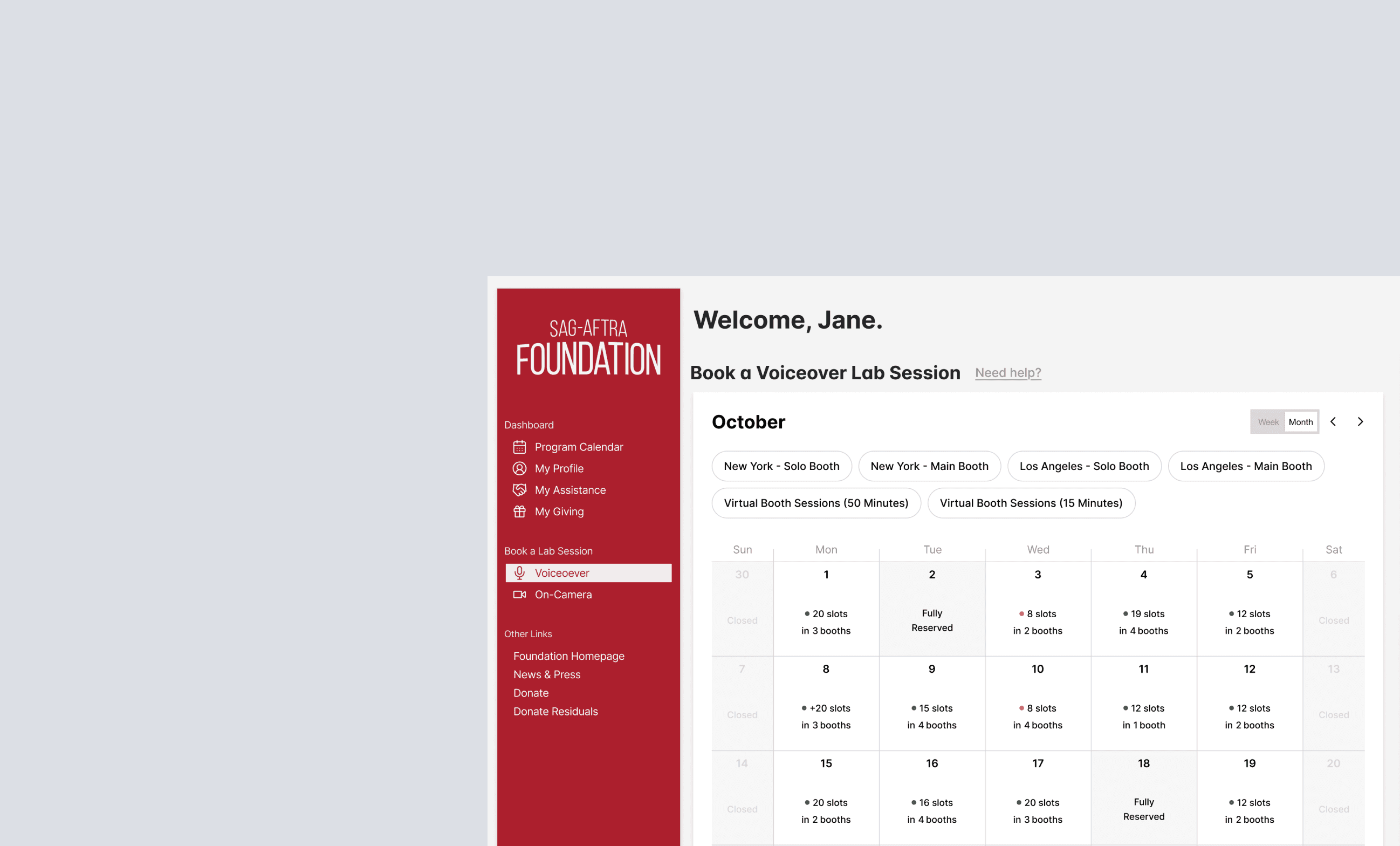
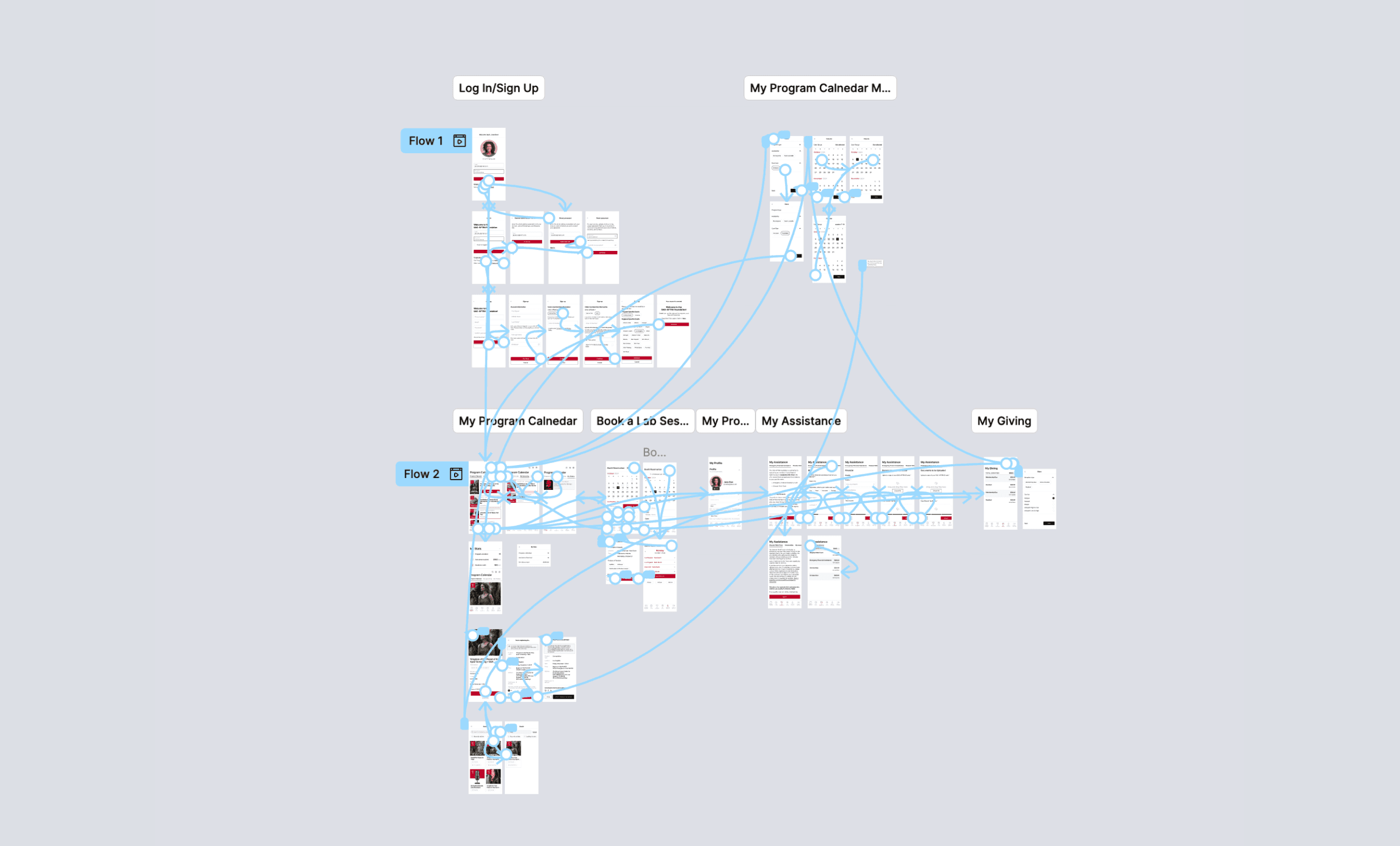
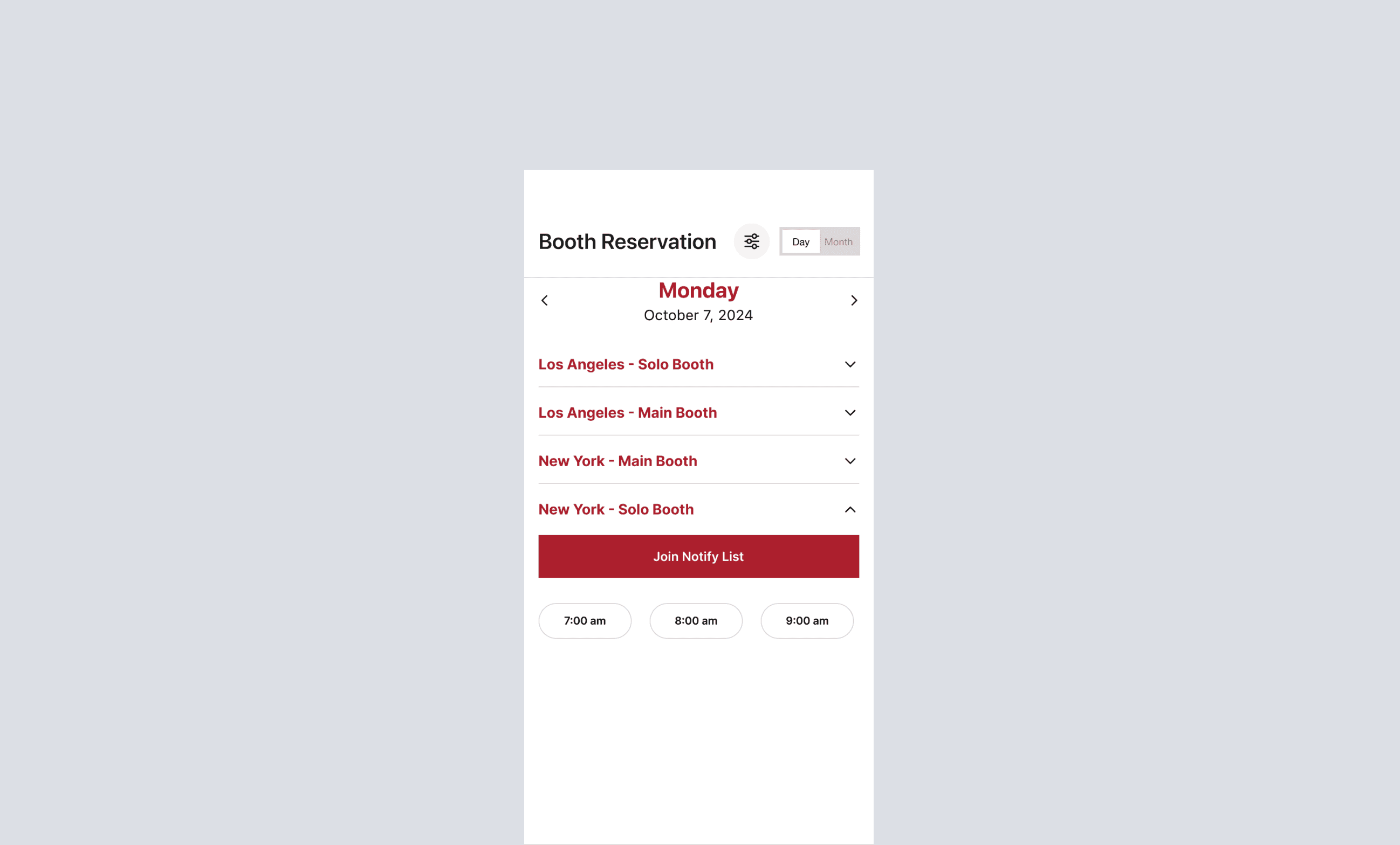
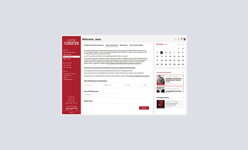
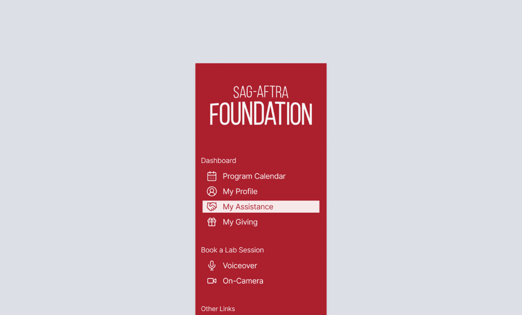
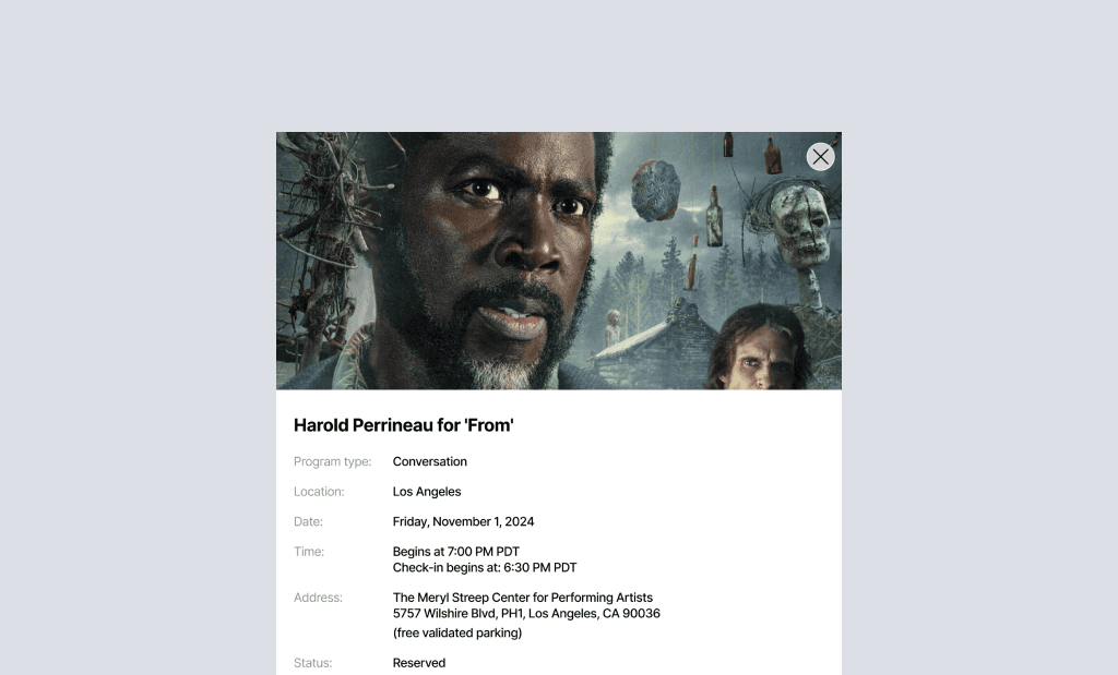
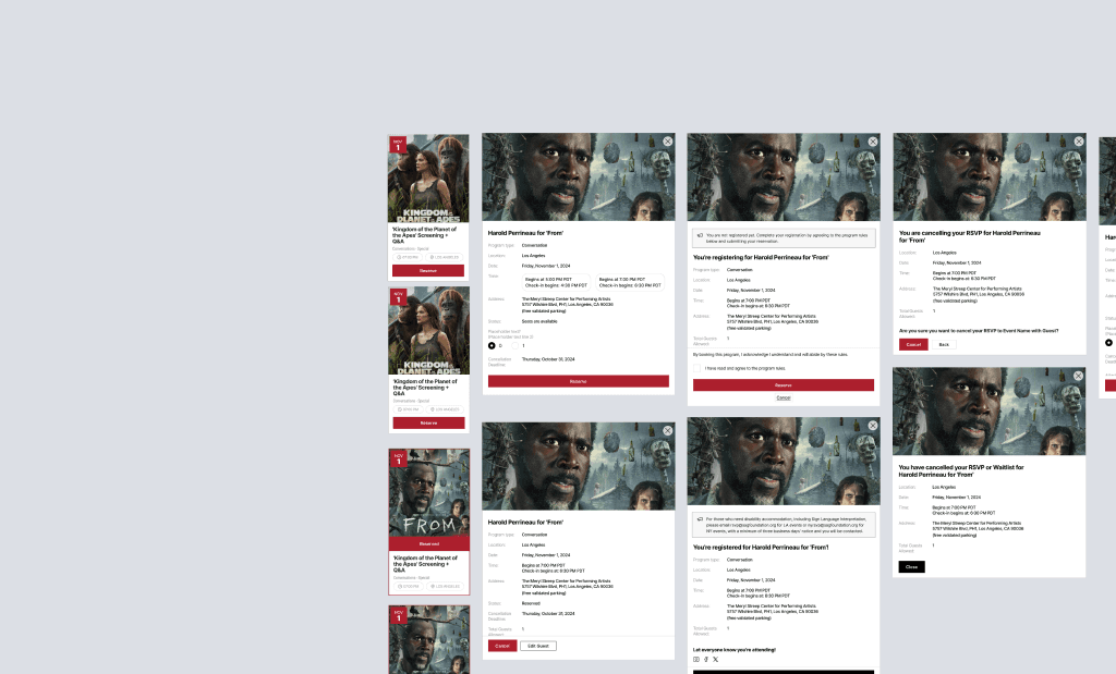
The SAG-AFTRA Foundation member dashboard needed a clearer way for users to find key information and reach important actions without extra friction. The project focused on improving the structure of the dashboard, simplifying the menu, and making the interface easier to scan. For a member portal, clarity matters because users should be able to understand where they are, what is available, and what to do next without thinking too much. My work covered UX/UI design, dashboard structure, user flows, visual hierarchy, Figma components, and handoff preparation.
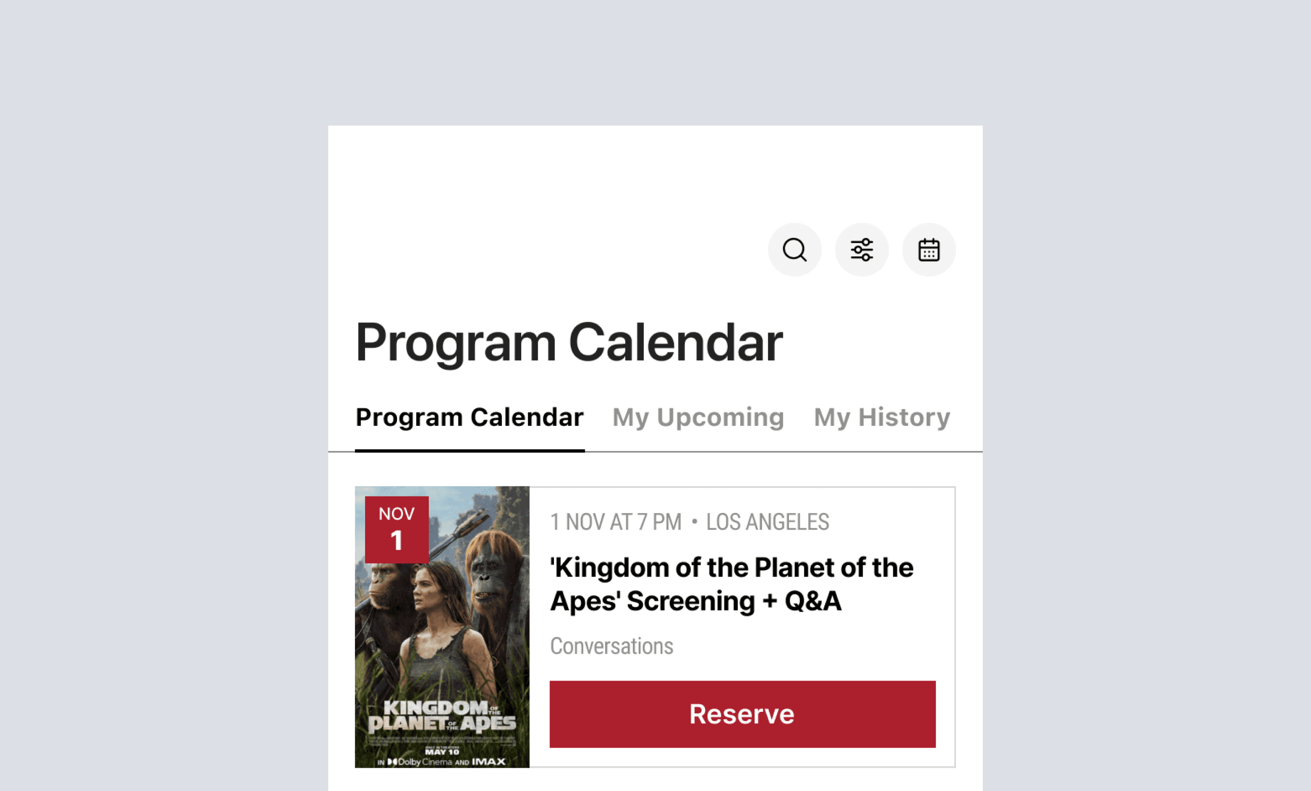
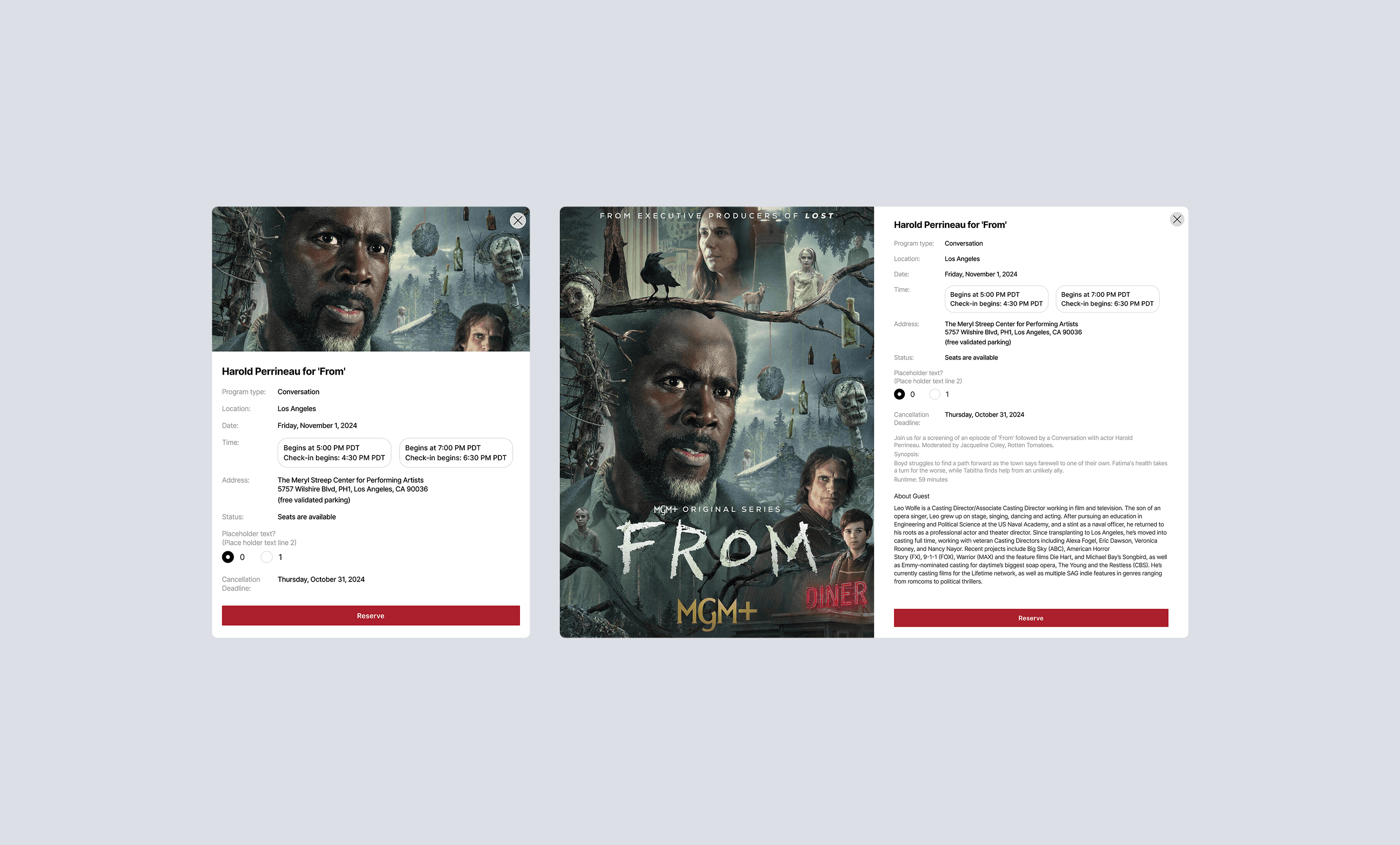
Large Project Gallery Image #1
Large Project Gallery Image #2
Project Gallery Image for 50% width of the screen #1
Project Gallery Image for 50% width of the screen #2
Project Gallery Image for 50% width of the screen #1

A simpler way to reach core dashboard actions

I focused on making the dashboard feel more organized and easier to use. Related actions were grouped more clearly, the menu structure was simplified, and key areas were redesigned so members could reach important functions with fewer steps. The final design gave the interface a clearer structure and a more consistent Figma foundation for future implementation.

Create a free website with Framer, the website builder loved by startups, designers and agencies.